Finding the Right Care, Faster
Members often struggled to find in-network providers, compare options, and understand coverage details. I led the redesign of the provider search experience to make healthcare navigation simpler, faster, and more accessible across devices.
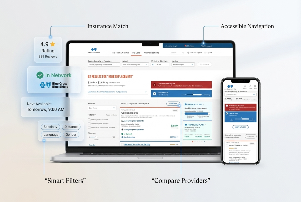
Healthcare UX is emotional
Members were often unsure whether a provider was actually covered, accepting new patients, or appropriate for their condition. For users managing chronic care or urgent health needs, even small moments of confusion created anxiety and delayed decision-making. The experience felt fragmented across filters, provider details, and plan information.
Insurance Confusion
Members struggled to understand whether providers were actually covered under their plans.
Decision Fatigue
Too many filters and inconsistent provider details made comparison difficult.
Fragmented Experience
Important information was spread across multiple screens and systems.
Accessibility Gaps
Key interactions lacked clear focus states and readable hierarchy.
My Role
As the lead UX designer, I led the redesign of the provider discovery experience across research, workflows, UI design, accessibility, and responsive experiences. The goal was to simplify how members search, compare, and confidently choose care.
UX Research
Analyzed member pain points, navigation friction, and provider search behavior.
Experience Design
Designed responsive search, filtering, and provider comparison workflows.
Accessibility
Applied WCAG 2.1 standards across layouts, interactions, and content hierarchy.
Collaboration
Worked closely with PMs and engineers to align usability with technical constraints.
Understanding User Needs
Research Overview
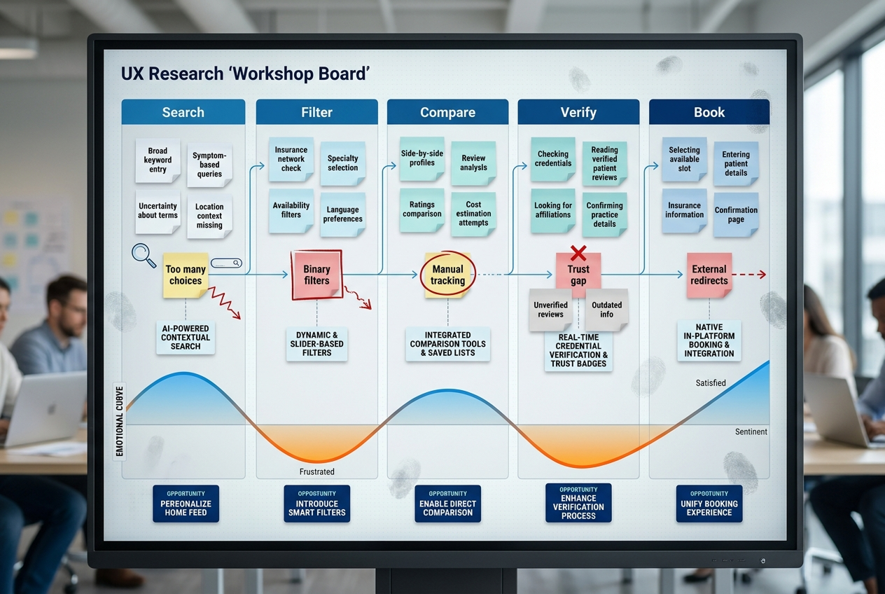
To better understand how members navigated provider search, we reviewed usability pain points, search refinement behavior, and provider selection patterns across the existing experience.
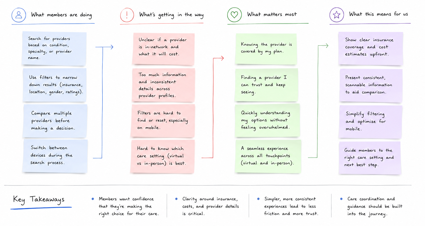
We found that members often entered provider search already feeling uncertain about insurance coverage, provider quality, and next steps in their care journey. Even small moments of friction reduced confidence and increased abandonment.
Members compared multiple providers before deciding
6 out of 8 participants opened several provider profiles simultaneously because they didn’t feel confident enough to decide directly from search results.
Insurance filters became the primary decision driver
Most users applied insurance-related filters within the first few interactions, but many were still unsure whether providers were truly covered under their plan.
Mobile users restarted searches more frequently
Mobile sessions showed higher refinement behavior, with users repeatedly changing filters or restarting searches when results felt too broad or irrelevant.
Users hesitated when provider information felt incomplete
Participants often paused or abandoned flows when provider details, availability, or specialty information appeared inconsistent across screens.
Pain Points Identified
- Insurance coverage and network information lacked clarity
- Filtering options created cognitive overload for members
- Provider information appeared inconsistent across screens
- Critical decision-making information was buried below the fold
Design Opportunities
- Simplify provider comparison workflows
- Surface insurance visibility earlier in the experience
- Reduce filtering complexity with progressive disclosure
- Improve readability and accessibility across devices
Supporting members with different levels of health literacy, urgency, and care familiarity.
Sarah
Tech-Savvy Professional
Needed fast provider discovery, scheduling tools, and clear insurance visibility.
John
Chronic Care Management
Needed simplified healthcare navigation and accessible experiences.
Maria
Family Healthcare Coordinator
Needed tools to manage providers and coverage for multiple family members.
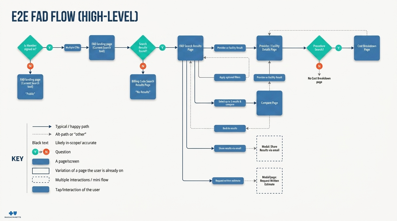
Reducing friction in how members search, filter, and evaluate healthcare providers.
Mapped critical healthcare journeys to reduce friction and support faster decision-making.
Iterating from low-fidelity concepts to scalable UI patterns
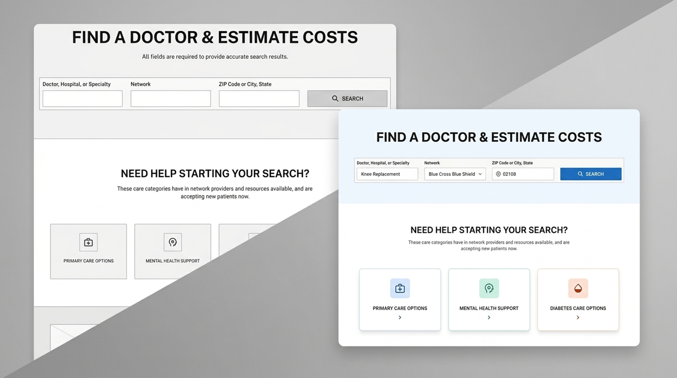
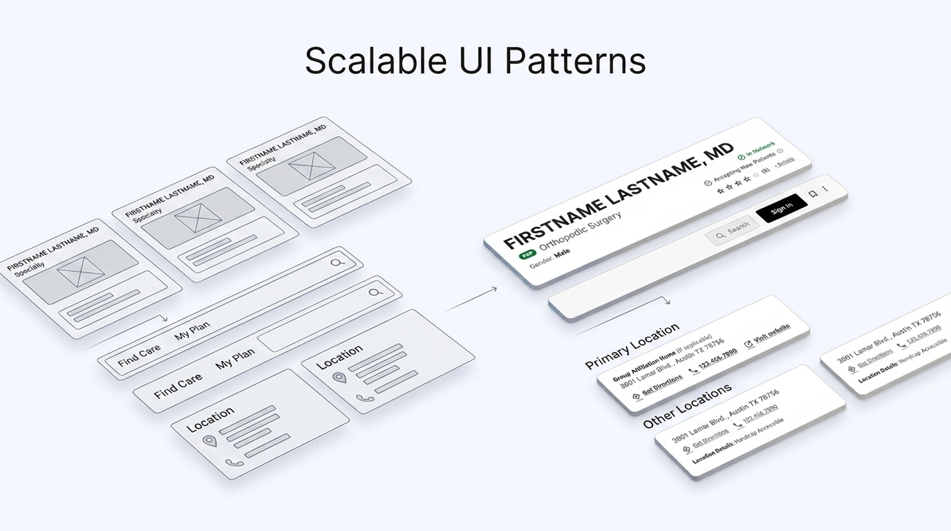
Making provider search easier to navigate for members with varying accessibility needs and healthcare confidence levels.
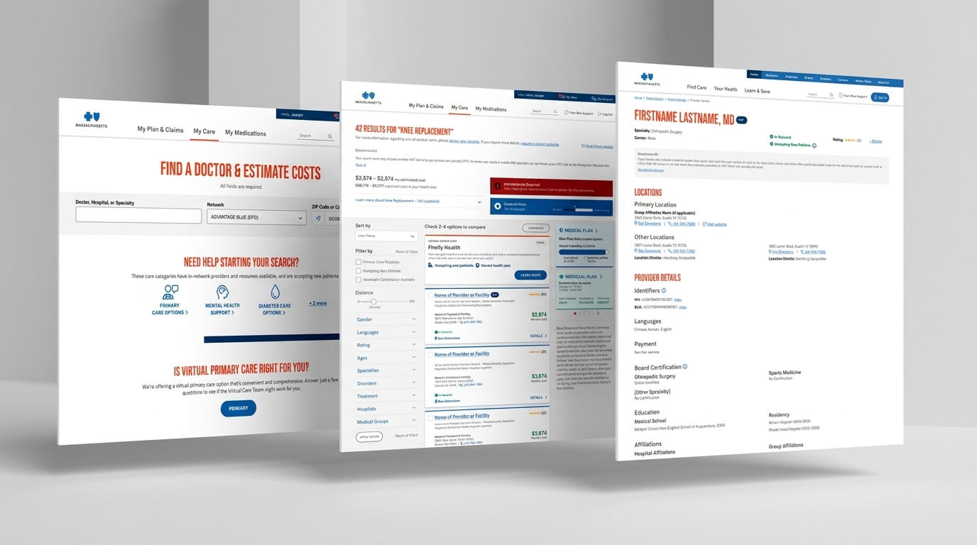
Personalized Search
Displayed insurance-aware provider recommendations tailored to member plans and preferences.
Enhanced Filtering
Added advanced filtering for location, specialties, ratings, gender, and virtual care.
Provider Profiles
Redesigned provider detail pages with clearer hierarchy and contextual information.
Responsive Experience
Optimized workflows across desktop and mobile devices for seamless care navigation.
Designing inclusive healthcare experiences
- Designed interfaces aligned with WCAG 2.1 AA guidelines
- Improved keyboard navigation and focus states
- Optimized color contrast and typography readability
- Implemented semantic structures for screen readers
- Reduced accessibility barriers across healthcare workflows
Improving provider discovery and member engagement
Balancing healthcare complexity with usability
Designing for diverse healthcare audiences required balancing simplicity, accessibility, and enterprise-level complexity while maintaining alignment across stakeholders, developers, and product teams.