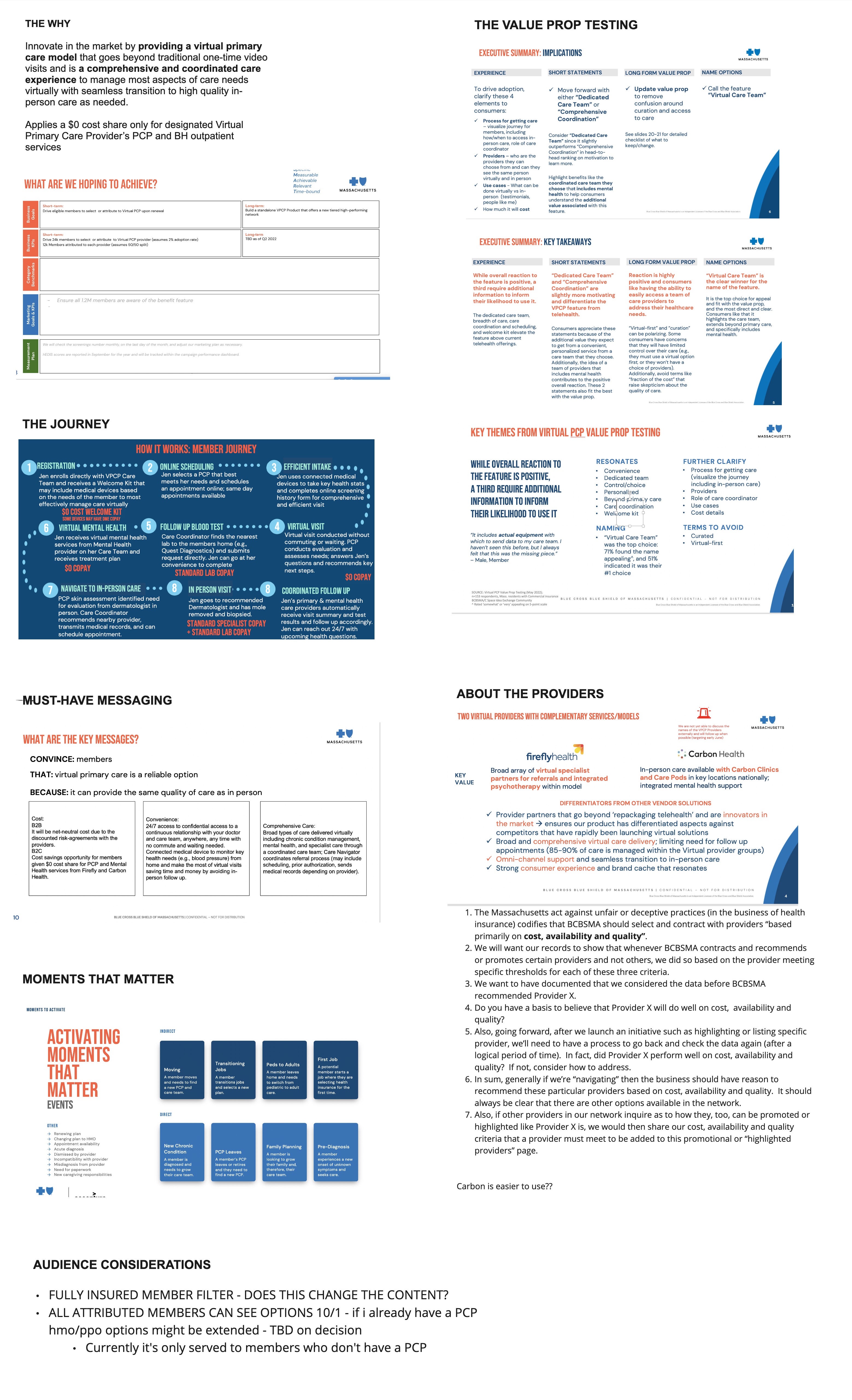
Redesigning the “Find a Doctor” Experience
Navigating the healthcare system can be a complex and frustrating experience—especially for members managing chronic conditions, coordinating care across multiple providers, or trying to understand their insurance coverage. As the Lead UX Designer for BCBSMA’s Care Navigation Platform, I spearheaded the redesign of the “Find a Doctor” feature—one of the most critical tools for empowering users to take control of their healthcare journey.
Our objective was clear: create a simplified, intuitive, and accessible experience that would help members easily find in-network doctors, compare care options, and make informed decisions—all while meeting strict accessibility compliance standards.
Challenges of Old Doctor Finder Designs
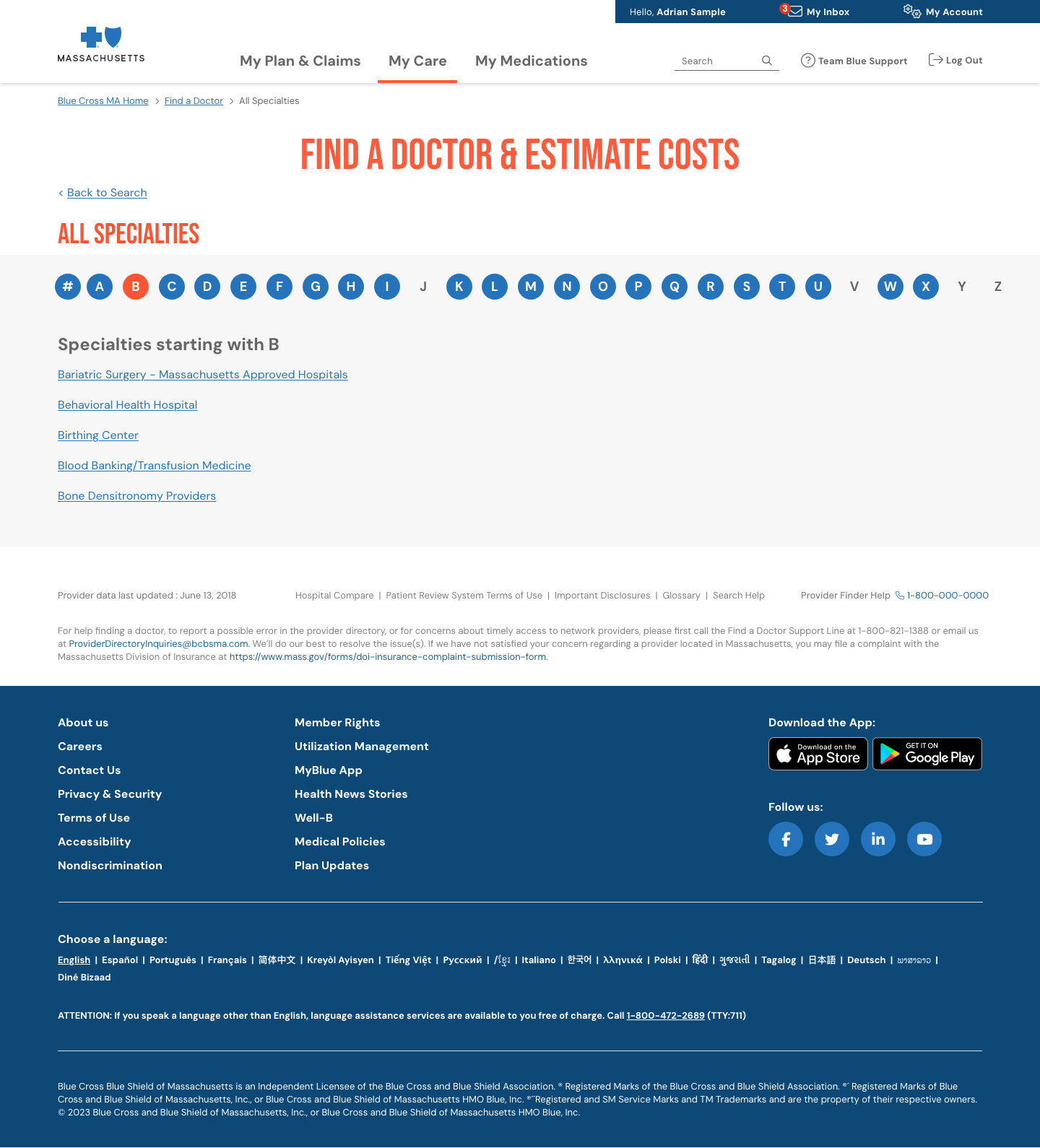
- Cluttered Interface: Current designs prioritize text-heavy layouts, making it difficult for users to quickly find relevant information. There is often no clear visual hierarchy, and pages can feel overwhelming.
- Limited Search Options: Current platforms offer basic search options, which limits users’ ability to find the right doctor based on more specific preferences like insurance, language spoken, Rating, Distance or gender.
- No Personalization: Current designs usually lack user personalization features, such as saving favorite doctors, reviewing medical history, or getting suggestions based on previous searches.
- No Engagement with Systems: Current platforms have not integrate with other healthcare systems, such as patient portals, or real-time booking systems, making it difficult for users to verify appointment availability.
My Role & Approach
As the UX Lead, I collaborated cross-functionally with product managers, accessibility experts, developers, and stakeholders:
- Conducting user research and stakeholder interviews to identify pain points and behavioral patterns.
- Mapping the user journey to highlight key decision points and information gaps.
- Creating low- to high-fidelity wireframes and prototypes in Adobe XD.
- Facilitating design workshops and co-creation sessions with internal teams and member representatives.
- Leading accessibility audits and incorporating feedback to ensure WCAG 2.1 AA compliance.
Research & Discovery Phase
User Personas
To ensure the design met the needs of BCBSMA members, I created the following user personas based on research:
Persona 1: Sarah (Tech-Savvy Millennial)
Age: 30
Occupation: Marketing Manager
Tech Comfort: High
Needs: Quick, easy access to care options, understanding of coverage, and digital tools for scheduling and managing care.
Persona 2: John (Baby Boomer with Chronic Conditions)
Age: 62
Occupation: Retired Teacher
Tech Comfort: Moderate
Needs: Clear navigation of healthcare services, assistance with managing chronic conditions, and personalized care recommendations.
Persona 3: Maria (Busy Working Mom)
Age: 42
Occupation: Lawyer
Tech Comfort: Moderate to High
Needs: Quick access to pediatric care options, ability to manage family coverage, and seamlessly add a Primary Care Provider (PCP) and multiple care providers for various family members, all in one platform.
User Flows
Based on the user personas, I created multiple user flows to ensure a smooth, intuitive experience. Key flows included:
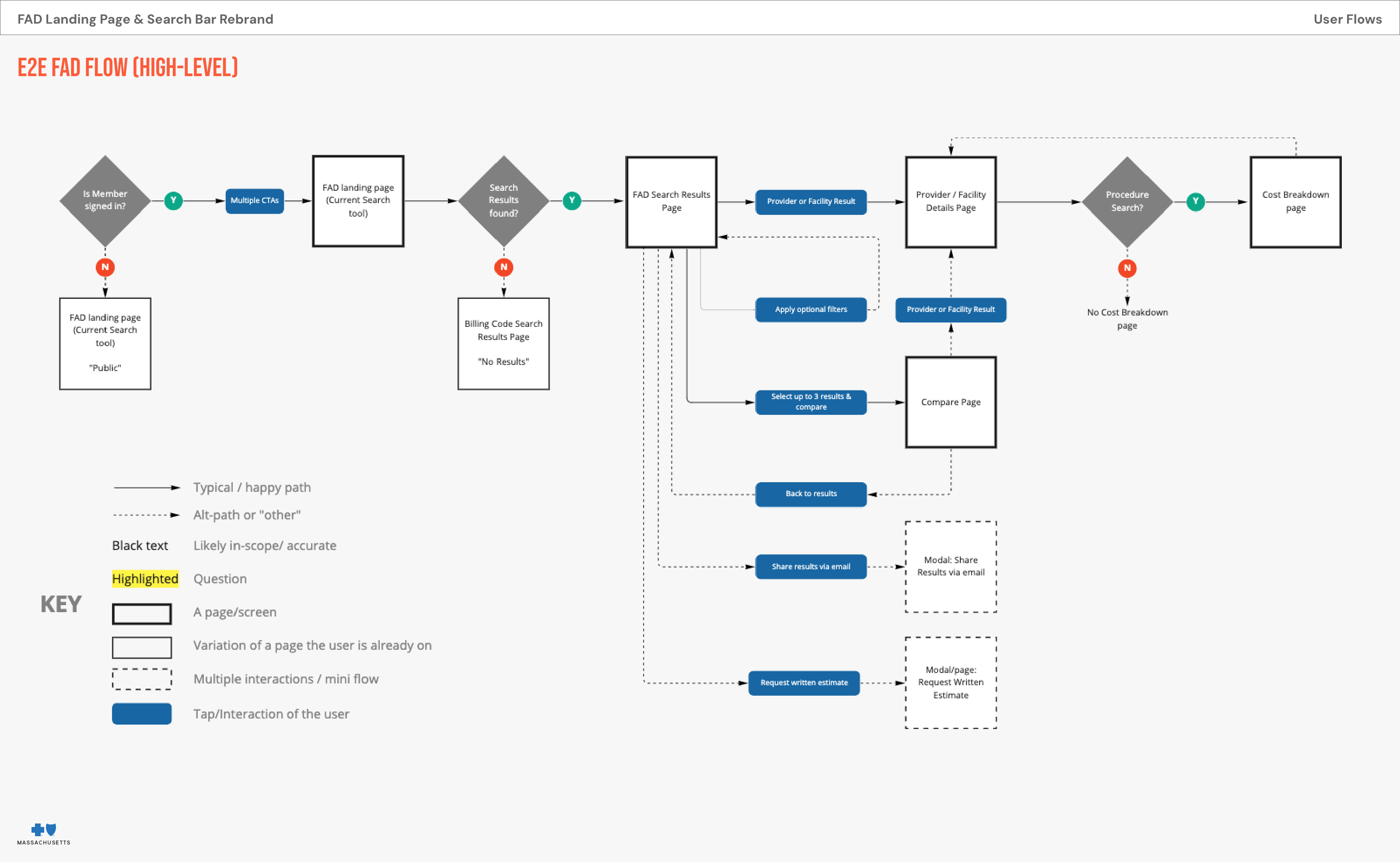
- Finding a Provider: Start at the home screen > Select "Find a Doctor" > Enter location or specialty > View list of providers > Filter results based on insurance coverage, ratings, etc. > Select a provider > Book appointment.
- Managing Benefits & Coverage: Start at the dashboard > Select "My Benefits" > View plan details, coverage, and benefits > Find providers or healthcare services covered under the plan > Make a call to support if needed.
- Navigating Care for Chronic Conditions: Start at the home screen > Select "Manage Chronic Conditions" > View resources tailored to specific conditions > Get recommendations for lifestyle adjustments, medical providers, and treatment options.
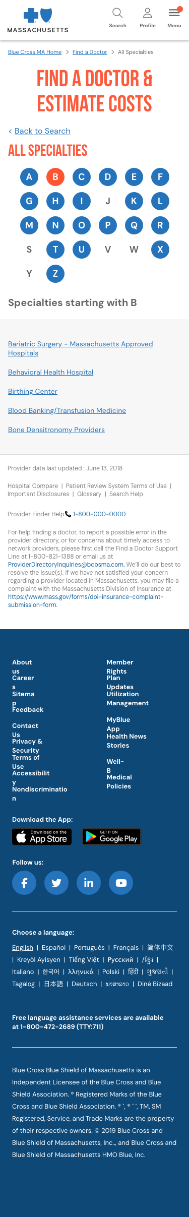
Low-Fidelity Wireframes (Lo-Fi)
At this stage, I focused on simplifying the user experience by structuring the core interactions and navigation. The Lo-Fi wireframes featured:
- A clear, top-level navigation bar.
- Simple icons and text to guide the user.
- Easy-to-understand content blocks and call-to-action buttons.
- Basic wireframe designs for key pages such as the homepage, provider search, and benefit management screens.
These wireframes helped facilitate early discussions with stakeholders and developers and allowed us to quickly iterate and refine key features.


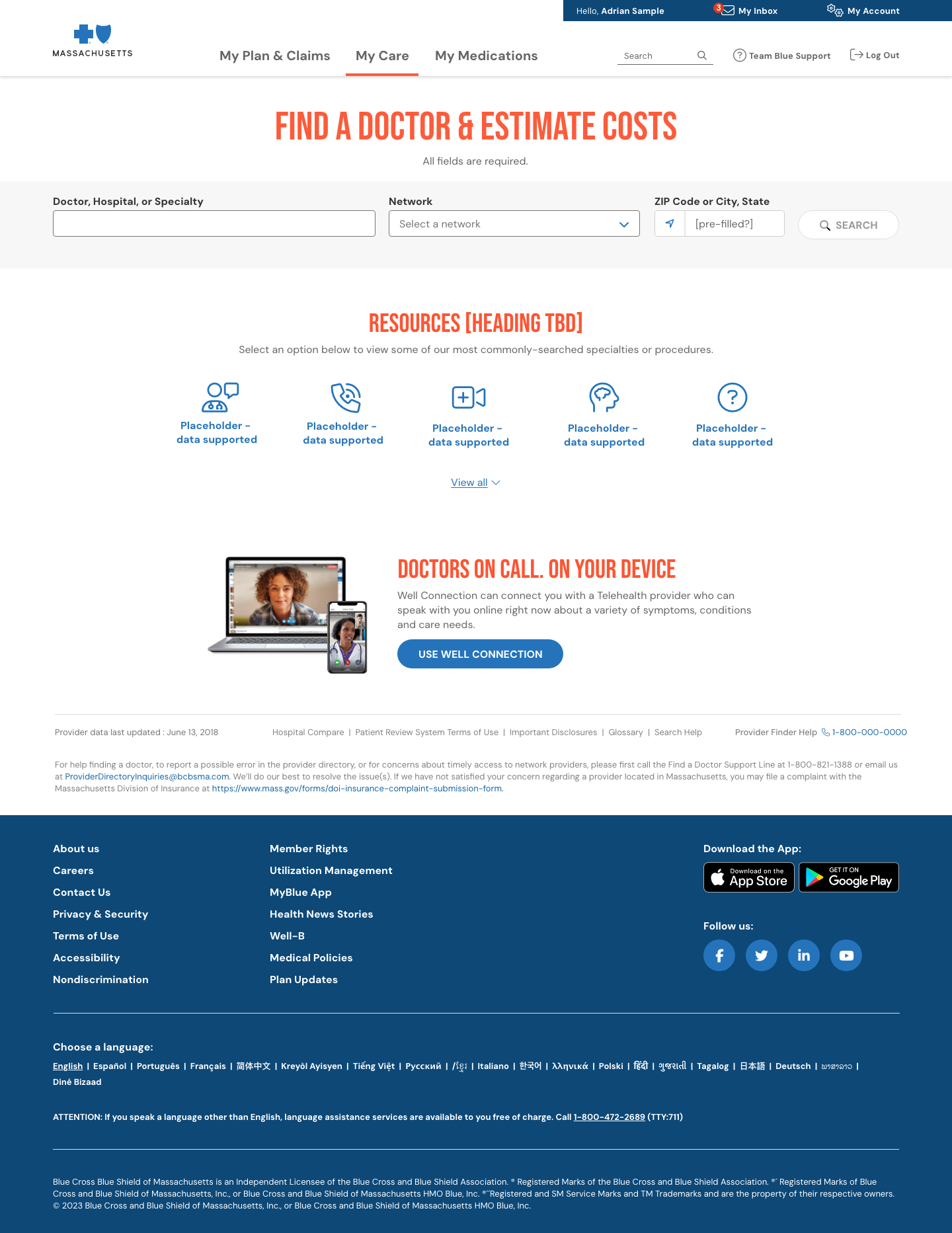
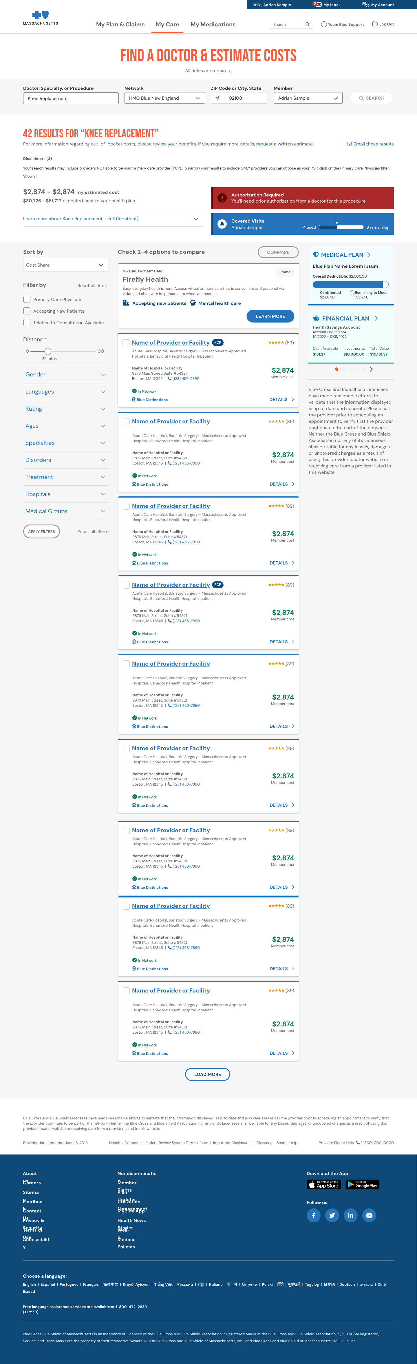
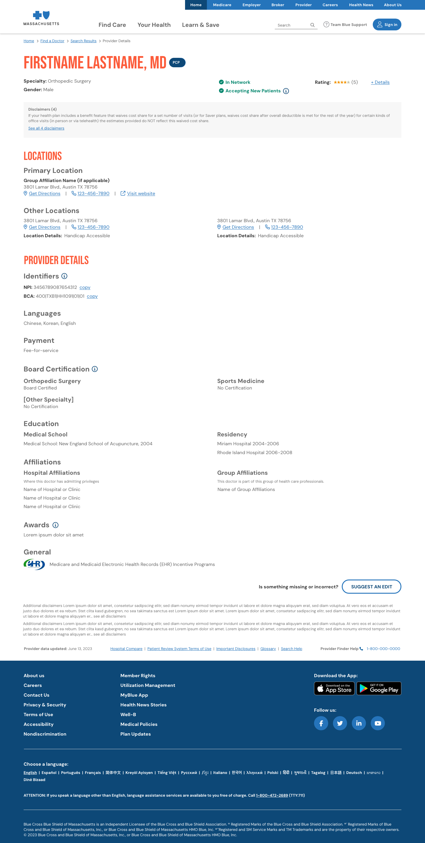
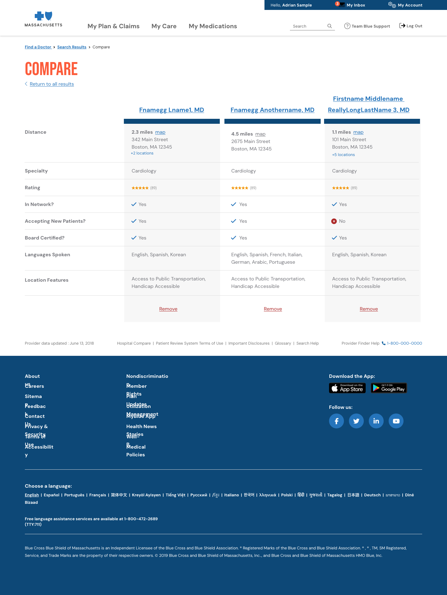
High-Fidelity Concepts (Hi-Fi)
After gathering feedback on the Lo-Fi wireframes, I transitioned to high-fidelity designs using Adobe XD. The Hi-Fi designs aimed to:
- Create a visually appealing, professional aesthetic aligned with BCBSMA’s brand identity.
- Enhance accessibility, ensuring that color schemes, font sizes, and button designs adhered to WCAG 2.1 AA standards.
- Incorporate intuitive and clear interactions that catered to the varying tech comfort levels of users.
The Hi-Fi designs included:
- Streamlined Search Displaying healthcare providers, nsurance-specific provider availability for personalized results.
- Personalized, Relevant Results: Integrated plan-level information, ensuring members only saw in-network providers.
- Displayed contextual indicators (e.g., “Accepting New Patients”, “Virtual Visit Available”, “Close to You”).
- Provider Profiles Redesigned: Simplified layout with clearly grouped content (overview, specialties, reviews, locations).
- Integrated cost estimators and patient ratings for transparency.
- Mobile-First, Fully Accessible Design: Redesigned UI with semantic HTML structure, keyboard navigation, screen reader labels, and color contrast standards.
Result & Final Design
After multiple iterations and user testing, the final design provided a streamlined and intuitive experience for users. Key features included:
- Personalized Experience: Based on the user's insurance plan, location, and preferences.
- User-Centered Navigation: Simple, easy-to-follow navigation that ensured the right information was always a few clicks away.
- Accessibility: Ensured compliance with accessibility guidelines, providing an inclusive experience for users with different needs.
- Responsive Design: The product was optimized for both mobile and desktop, offering a consistent experience across all devices.
The final design was delivered to the development team, with detailed specifications for implementation, including all interactive elements and accessibility considerations.
Tools Used
- Adobe XD: For creating interactive wireframes, prototypes, and high-fidelity designs.
- Miro: For brainstorming sessions, user journey mapping, and collaboration with cross-functional teams.
- Jira: For project management, tracking tasks, sprints, and ensuring timely delivery of milestones.
Challenges & Lessons Learned
- Balancing Complexity & Simplicity: The product aimed to serve a wide range of users with varying technical abilities. Ensuring the design was simple enough for less tech-savvy users, yet powerful enough for advanced users, was a constant balancing act.
- Stakeholder Alignment: Ensuring that all stakeholders (from product managers to developers) were aligned throughout the process was crucial for avoiding scope creep and maintaining focus on user-centered goals.
- Accessibility Focus: Making the product accessible to users with disabilities was a significant challenge. Ensuring compliance with WCAG and Section 508 required constant testing, but it was rewarding to know that the product would be inclusive for all users.
Impact
The Care Navigation product successfully improved the user experience for BCBSMA members by making it easier for them to navigate healthcare services, find providers, and manage their benefits. The design led to an increase in user engagement, better care management, and a more personalized experience for members.