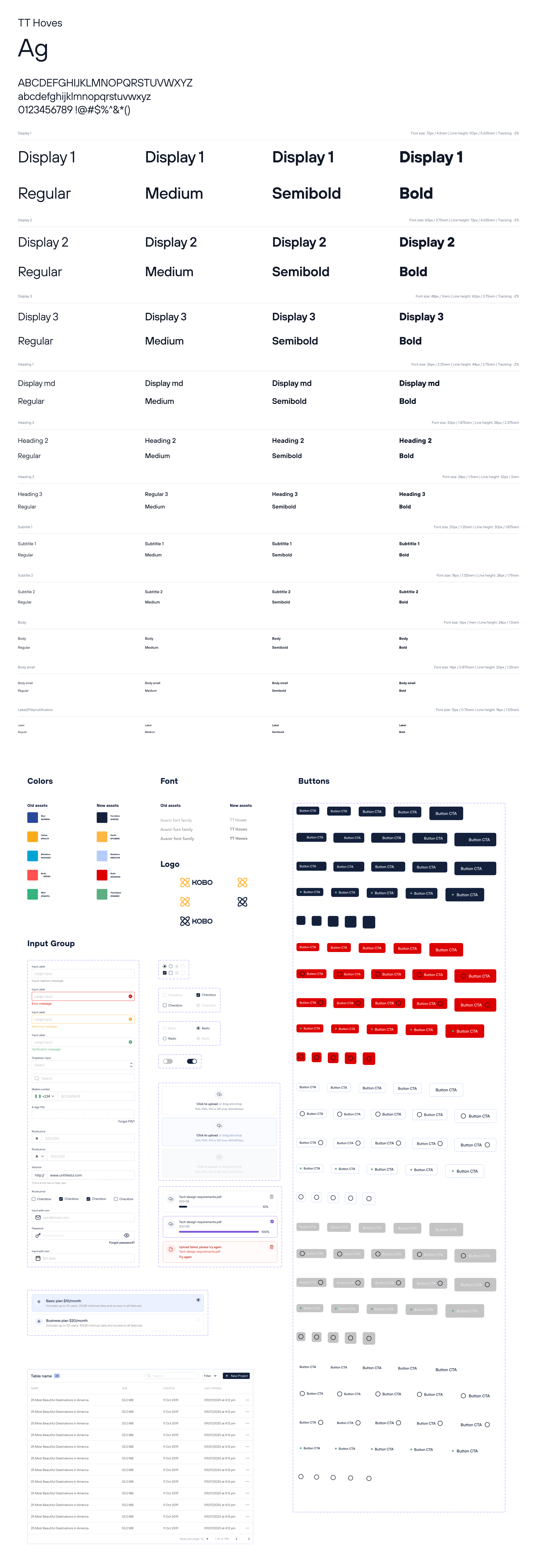
KOBO360 Design System
Creating and documenting a product design system

In the dynamic realm of digital design, consistency and scalability are paramount. This case study explores the development and implementation of a comprehensive design system for Kobo360, illustrating how it not only unified the visual language but also streamlined the design and development processes for optimal user experiences.
Harmony in Design
Kobo360 faced challenges in maintaining a consistent and cohesive brand presence across its digital products. The absence of a standardized design system led to inconsistencies in user interfaces, increased development time, and hindered collaboration between design and development teams.
Objective
- Establish a unified visual language across all digital products.
- Improve design and development efficiency through reusable components.
- Enhance collaboration and communication between design and development teams.
- Ensure scalability for future product expansions.
Solution
Our team undertook a meticulous process to address the challenges and meet the objectives:
Discovery and Research
- Conducted an in-depth analysis of existing design assets, identifying patterns, and inconsistencies.
- Researched industry best practices and emerging design trends.
Design System Components
- Developed a comprehensive set of design components, including typography, color palettes, buttons, icons, and UI patterns.
- Ensured that each component was meticulously documented with guidelines for usage.
Prototyping and Testing
- Created interactive prototypes to test the usability and visual appeal of the design system.
- Collected feedback from stakeholders, designers, and developers to iterate and refine the components.
Implementation
- Collaborated closely with development teams to integrate the design system into the existing workflows.
- Provided thorough documentation and training to ensure seamless adoption.
Results
The implementation of the design system yielded significant positive outcomes:
- Achieved a cohesive and unified visual language across all digital products, strengthening the brand identity.
- Reduced design and development time by 20% through the use of reusable components and standardized design patterns.
- Facilitated better communication and collaboration between design and development teams, fostering a more streamlined workflow.
- Positioned Kobo for future scalability, allowing for efficient expansion of the product portfolio.
Mockup Design

This design system case study demonstrates how a thoughtful and systematic approach to design can lead to not only visual harmony but also improved efficiency and collaboration. The implemented design system has become a cornerstone for Kobo's digital experiences, providing a solid foundation for future innovations and maintaining a consistent brand presence across diverse products.