Blue Member Dashboard Redesign
The Blue Member Dashboard underwent a comprehensive redesign to create a more intuitive, personalized, and human-centered healthcare experience. Our goal was to empower members by making it easier to find care, understand their options, and make informed decisions.
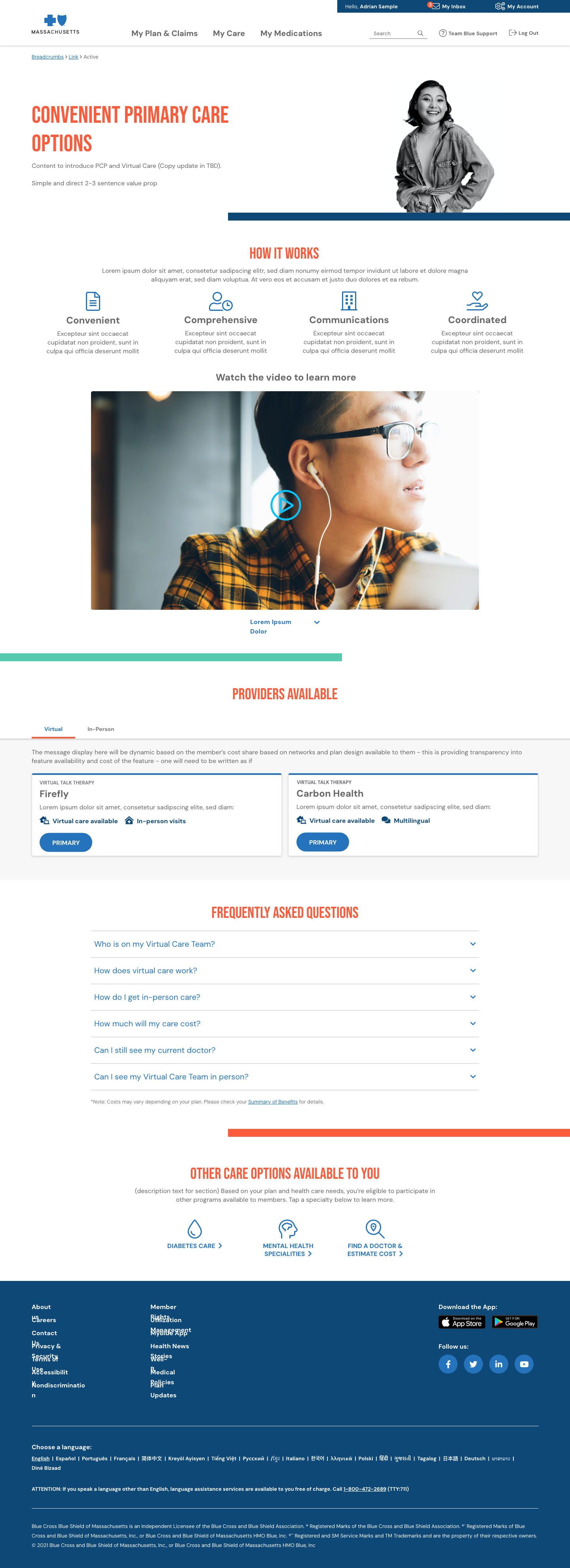
The new dashboard introduces personalized Care Options tailored to each member’s health profile and needs, an Educational Resource Center that offers easy-to-understand, condition-specific content, and intelligent provider matching that connects members with providers who are not only nearby and accepting new patients, but also aligned with the member’s care preferences. By focusing on proactive guidance and user-friendly design, the new dashboard streamlines healthcare navigation and helps members feel more supported throughout their care journey.
Problem Statement
Members found it difficult to navigate their dashboard, locate appropriate care, or connect with providers accepting new patients. The platform lacked personalization and proactive care suggestions.
- Fragmented care journey
- Lack of visibility into provider availability
- Minimal educational support
- Poor accessibility and mobile usability
Goals
- Redesign the dashboard to be more intuitive and accessible
- Introduce personalized Care Options
- Match members with humanized providers accepting new patients
- Add a dedicated Education Page to empower members
- Ensure WCAG 2.1 AA accessibility compliance
Process
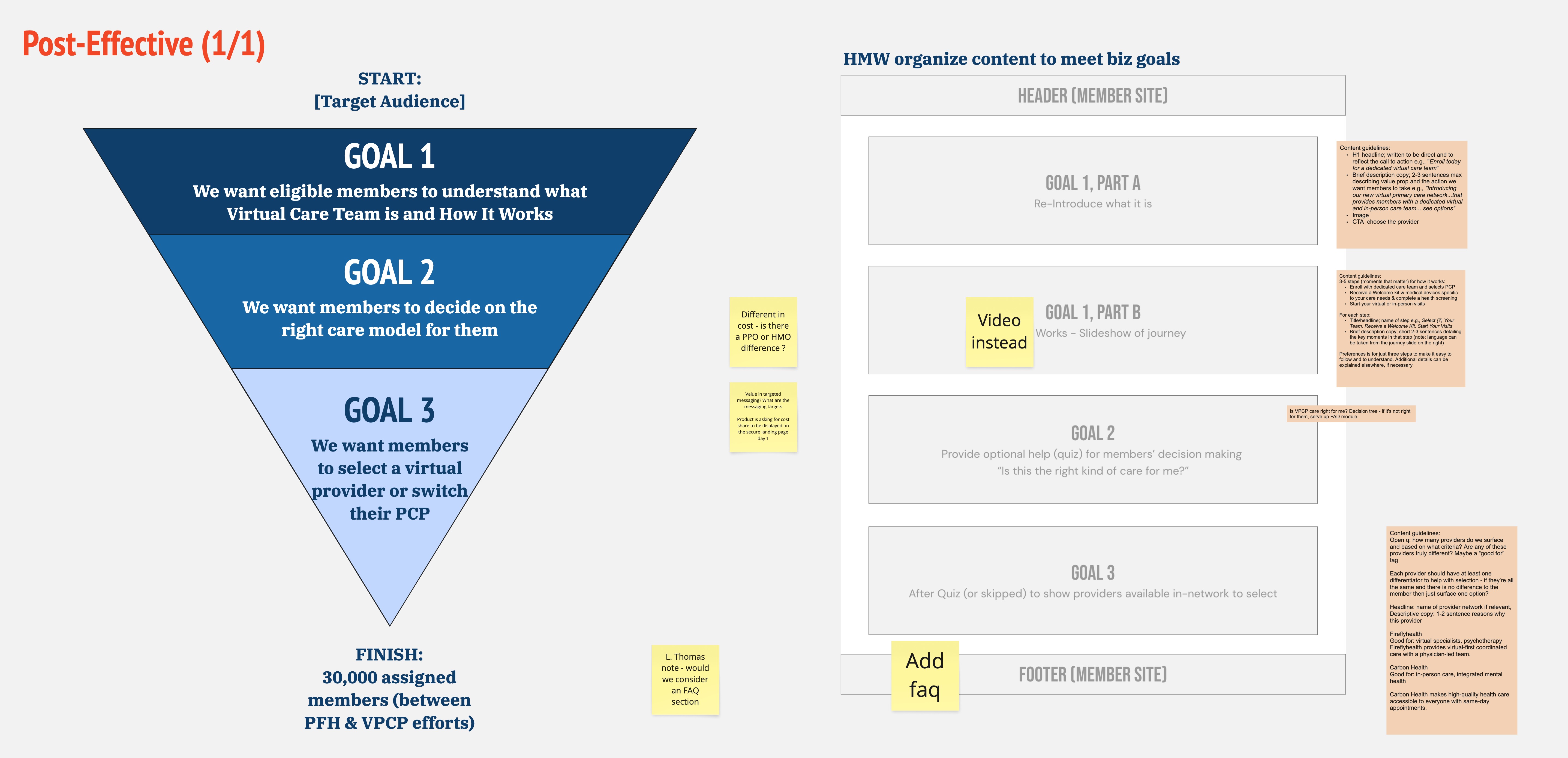
Research & Discovery
- User Interviews: Conducted 1:1 interviews with members across different personas (e.g., seniors, young families, chronic care users)
- Journey Mapping: Identified major drop-off points and confusion in the current dashboard
- Competitor Analysis: Benchmarked dashboards from other healthcare providers and fintech platforms
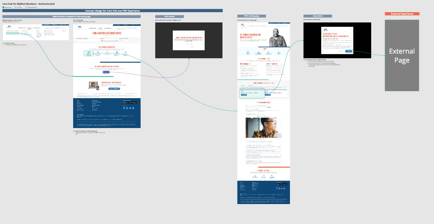
Ideation & Strategy
These wireframes helped facilitate early discussions with stakeholders and developers and allowed us to quickly iterate and refine key features.
- Created low-fidelity wireframes on Miro
- Defined user flows for key tasks (e.g., "Find a provider", "Explore care options", "Understand my coverage")
- Prioritized features using the MoSCoW method (Must-have, Should-have, etc.)
Key Features Designed
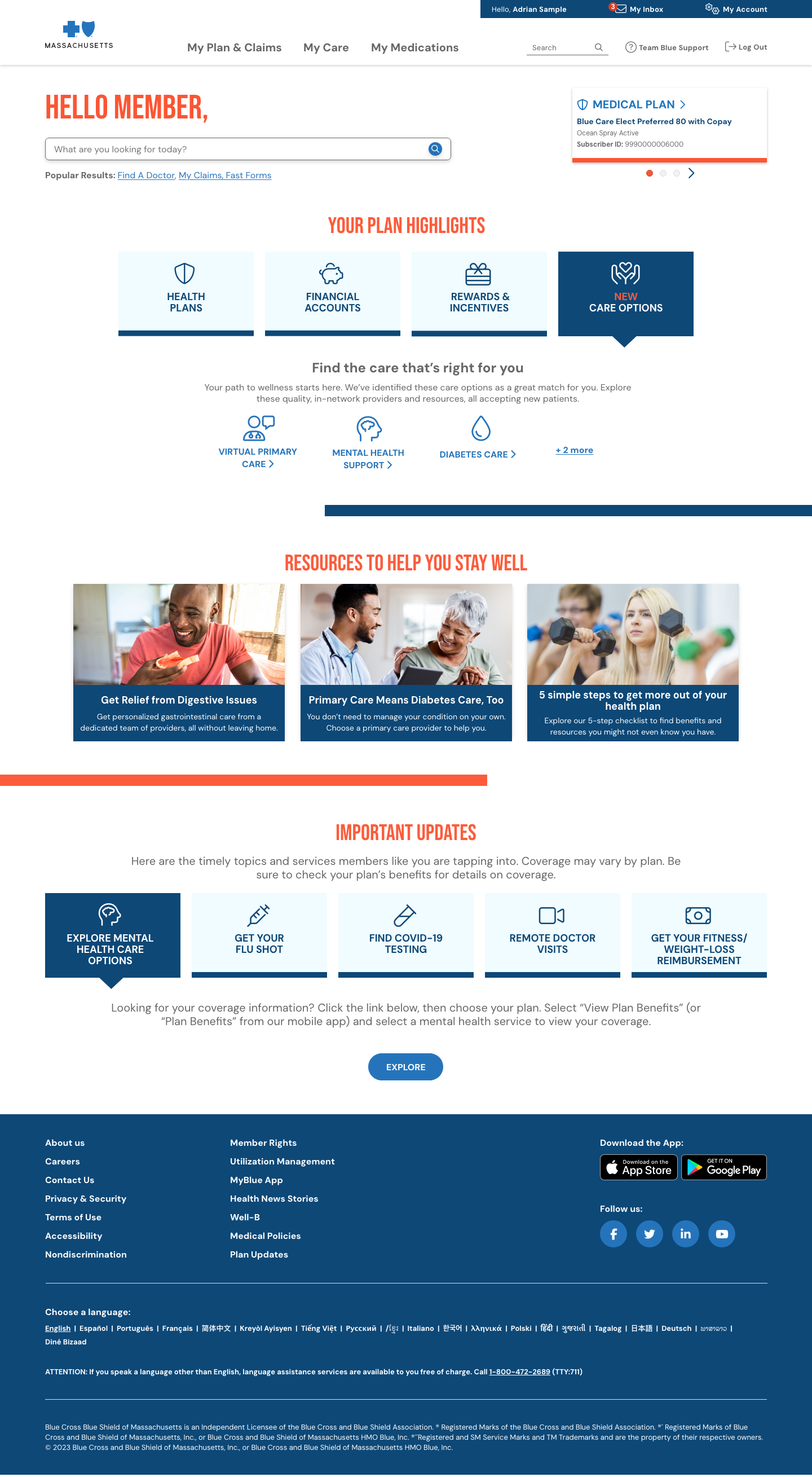
Personalized Member Dashboard
- Streamlined layout focused on what matters most: care, benefits, and next steps
- Integrated profile-driven insights (age, care history, location)
Care Options Page
- AI-driven recommendations based on member needs
- Preventive, urgent, mental health, and specialty care options
- Visual cards with clear CTAs (e.g., “Book Virtual Visit” or “Find In-Person Care”)
Care Options Page
- AI-driven recommendations based on member needs
- Preventive, urgent, mental health, and specialty care options
- Visual cards with clear CTAs (e.g., “Book Virtual Visit” or “Find In-Person Care”)

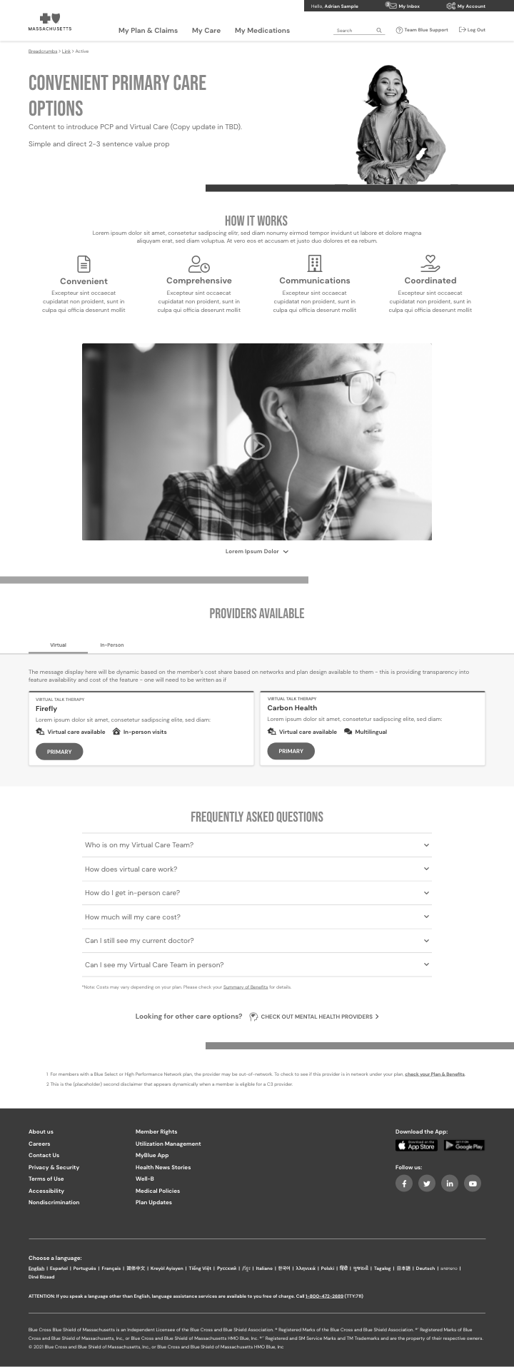
High-Fidelity Concepts (Hi-Fi)
After gathering feedback on the Lo-Fi wireframes, I transitioned to high-fidelity designs using Adobe XD. The Hi-Fi designs aimed to:
- Create a visually appealing, professional aesthetic aligned with BCBSMA’s brand identity.
- Enhance accessibility, ensuring that color schemes, font sizes, and button designs adhered to WCAG 2.1 AA standards.
- Incorporate intuitive and clear interactions that catered to the varying tech comfort levels of users.
The Hi-Fi designs included:
- Personalized Dashboard: Displaying healthcare benefits, appointment history, and personalized care recommendations.
- Provider Search: Interactive map and filter options to find in-network providers.
- Care Navigation: Easy access to health resources, care management, and disease-specific tools for chronic conditions.

Result & Final Design
After multiple iterations and user testing, the final design provided a streamlined and intuitive experience for users. Key features included:
- Personalized Experience: Based on the user's insurance plan, location, and preferences.
- User-Centered Navigation: Simple, easy-to-follow navigation that ensured the right information was always a few clicks away.
- Accessibility: Ensured compliance with accessibility guidelines, providing an inclusive experience for users with different needs.
- Responsive Design: The product was optimized for both mobile and desktop, offering a consistent experience across all devices.
The final design was delivered to the development team, with detailed specifications for implementation, including all interactive elements and accessibility considerations.
Tools Used
- Adobe XD: For creating interactive wireframes, prototypes, and high-fidelity designs.
- Miro: For brainstorming sessions, user journey mapping, and collaboration with cross-functional teams.
- Jira: For project management, tracking tasks, sprints, and ensuring timely delivery of milestones.
Challenges & Lessons Learned
- Balancing Complexity & Simplicity: The product aimed to serve a wide range of users with varying technical abilities. Ensuring the design was simple enough for less tech-savvy users, yet powerful enough for advanced users, was a constant balancing act.
- Stakeholder Alignment: Ensuring that all stakeholders (from product managers to developers) were aligned throughout the process was crucial for avoiding scope creep and maintaining focus on user-centered goals.
- Accessibility Focus: Making the product accessible to users with disabilities was a significant challenge. Ensuring compliance with WCAG and Section 508 required constant testing, but it was rewarding to know that the product would be inclusive for all users.
Impact
The Care Navigation product successfully improved the user experience for BCBSMA members by making it easier for them to navigate healthcare services, find providers, and manage their benefits. The design led to an increase in user engagement, better care management, and a more personalized experience for members.